Wednesday 6 May 2020

Final Evaluation Unit X 2020


Final Evaluation Unit X 2020


During Unit X I have developed some ideas which were started towards the end of the practice unit.  In this final year, I started by eco printing using natural forms and, at the same time, I was producing watercolour paintings of plants.  Getting inspired by the marks and patterns created by the steamed leaves onto cotton and silk, I started to produce digital repeat prints from my watercolour drawings and paintings, using Photoshop.  For Unit X I developed and progressed this approach further.

Practice Unit

Practice Unit


I started the project by visiting the Royal Botanic Gardens at Kew, Liberty, and the Foundling Museum in London.  I visited the Foundling Museum because I wanted to adapt Indian and Western plants together and thought they might have something about identity for children who were separated from their birth families.  It was mainly historical and about children who were separated from their parents and later put into service, so there was not really anything to inspire my work in looking at identity through nature.  However, Kew and Liberty were both very inspiring and gave me a lot of opportunities for photography to use in development.  Later, I went to the Royal Botanic Gardens in Edinburgh, with a friend from India who knows a lot about plants, and she pointed out that many plants grow in both countries.  This gave me the freedom to explore designs based on how well the forms in my drawings combined to make repeat patterns, rather than concentrating totally on origin.

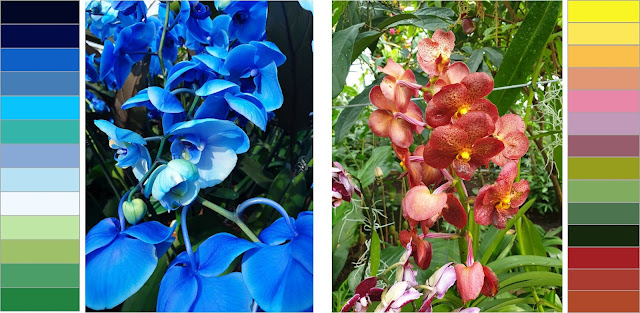
The development of colour palettes was from a selection of the photographs from Kew Gardens.   After the palette was ready, I could experiment creating patterns using Photoshop and visualise the design onto room settings.  Thankfully, before the lockdown, Tabina (another student) helped me with visualisation as I was stuck.  The tile and designs I developed in the beginning are definitely not up to the current standard, and with further practise they should get even better. I find the process of creating tiles for repeat patterns exciting because when it is a tile, you cannot see what it will 
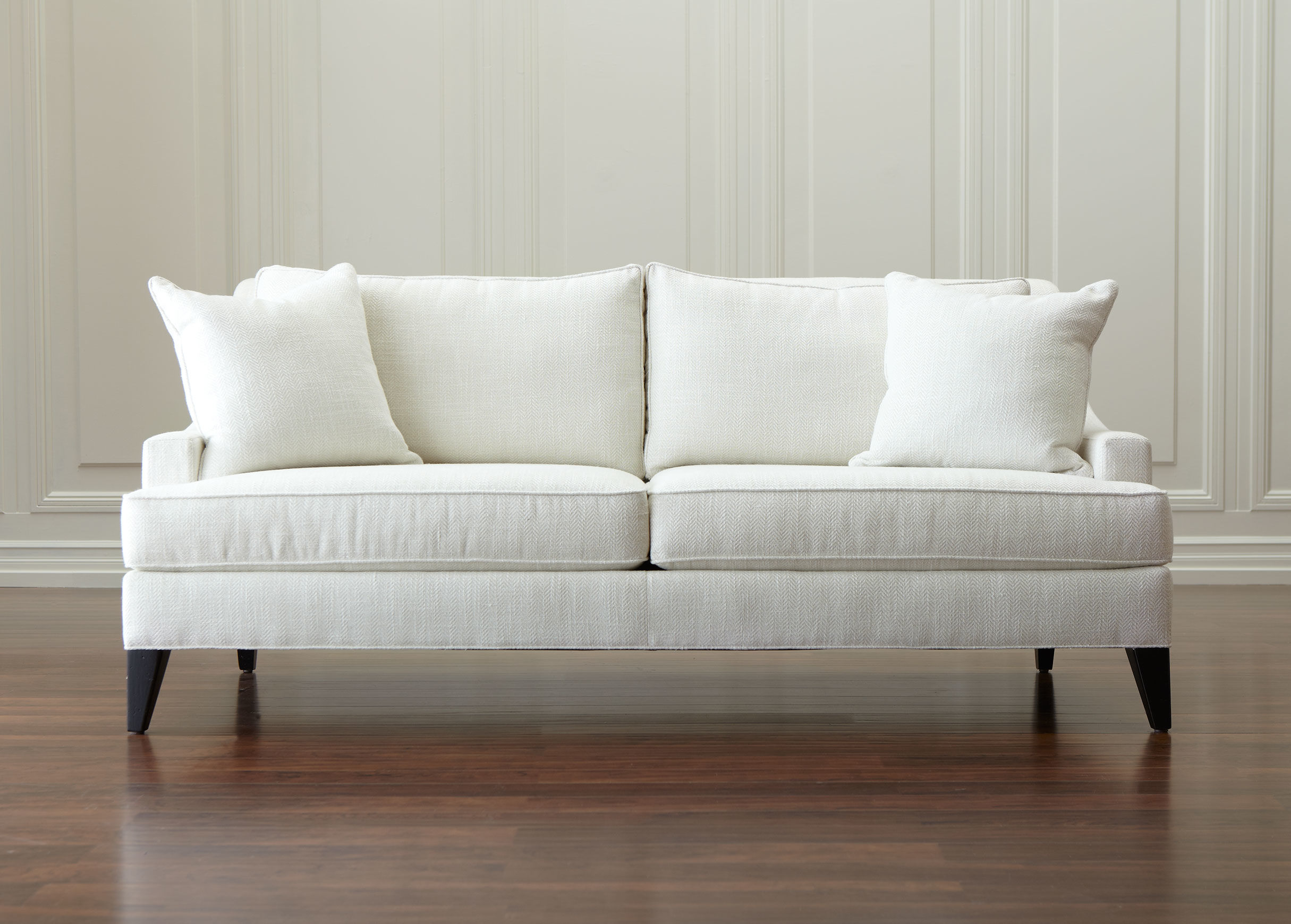
look like, and it’s just fascinating to see the final pattern emerge.  The designs are for interior purposes, such as wallpaper, bedding, sofas and cushions and they would be printed onto natural fabrics, such as cotton and silk, and wallpaper.


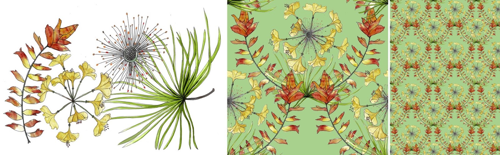
Drawing used - Tile - Pattern


For the final Portfolio I have chosen designs I believe to be high standard.  I have considered the market and the purpose of my designs.  I see them being used for bespoke soft furnishing and wallpapers which are high end rather than mass produced.  Having researched Osbourn and Little, an example of a large company, and Abigail Borg, an individual designer with her own business, it shows me the possibilities for my future.   


Finally, over the lockdown I have been volunteering for the Manchester Scrub Hub, sewing for the NHS.  I find this beneficial because I get to developed garment construction skill making trousers and tops and it feels good to put these skills to good use.


Wednesday 15 April 2020

Unit X Year 3


Identity through Nature


I have looked at designers from Liberty, Osborne and Little and Abigail Borg.   
Abigail Borg set up her wallpaper design business in 2009 and has since gone on to include fabrics and other homewares.  I love her floral designs, which start off from hand painting, following the process I have been using with Photoshop to develop the repeat pattern.  


Abigail Borg

Osborne and Little have designs from many designers including Mathew Williamson, Nina Campbell and others, in contrast to Abigail Borg who runs a business producing and selling her own designs.  Having been to Liberty, London, it was amazing to see the quality of prints and designs up close.


Osborne and Little, Mathew Williamson and  Nina Campbell


Liberty, London
The pictures were taken by me.


After looking at these designers I have been thinking of scale/size of my prints as I have shown in my visualisation.  I prefer the medium and the larger prints because it shows the detail of the print and is more dramatic.


My Designs and Visualisation


Snowdrops pattern.  I have marked the tile/block that was used for the repeat pattern and also have shown examples in different scales/size and background colours taken from the colour palette.

This is a combination of a seed head of a plant and an Indian flower, Marigold, shown as a wallpaper, but it can be used for any surface.  This is probably my favourite print so far because it has lightness and I like the flow of the pattern.


This print is shown in different scales to see which scale is most appropriate.  Some prints don't look good on every scale, but I quite like this pattern on all these different scales. It all depends on the layout of the tile/block or the types of drawings. 


This design is the same as the above and the one below, but showing developments with colour and I wanted to show a visualisation on a sofa and the wall (large scale).  I have visualised the cushion using my pin-tuck embroidery as a geometric contrast to the floral pattern.  


Colour palette

Indian flag
Making patterns using the seed-head drawing using the colours from the Indian flag which are included in my colour palette. 


Showing different scales. I prefer the larger scale with this print.  I have the tile/block that was used for this design. I've changed the cushion colour to orange to complement the design.


I wanted to see what some of my drawings looked like on a product so I experimented visualising them onto cushions.  I like the simplicity of the placement and I think they look good like this.


References.


Designers

https://www.abigailborg.com/

https://www.osborneandlittle.com/


Images used for Visualisation.


Tuesday 31 March 2020

Unit X Blog 2


Unit X - Year 3 - Identity Through Nature


Colour palette 

Tiles above and repeat pattern demonstration 

My drawings have been edited on Photoshop to investigate which of them were suitable for tiles/block to be repeated to make patterns.  Playing around mixing and combining all the drawings, and colours is never ending, which I find fascinating.  I am so glad I took help from Tabina, one of the other students, at a time I still could, because I would’ve been really stuck during quarantine.  I could’ve learnt it online like I’ve done in the past, but it was helpful to get support from someone who I understood.  Using repeat prints, I have done some visualising on bedding and interiors, which is my aim for my final outcome.   Before the uni closed, I had 13 samples printed on furnishing weight cotton.  This was before we knew that the final submission would be digital, but it is good to be able to see what they would look and feel like in reality.  I have only chosen some of my prints to show on the blog. 


Interior visualisation


For my visualisation I found the images on these websites 


Monday 2 March 2020

Unit X - Year 3 - Identity Through Nature

Identity Through Nature 
London - Kew Gardens


Towards the end of the practice unit, I produced repeat patterns using watercolour drawings and paintings of plants and I found that this form of work described my interest in nature and matched my skills.  For my unit X, I plan to develop this skill further and produce patterns for professional interior designs such as wallpaper, bedding and other soft furnishing.  


All the above - watercolour painting on paper done by me.


For my practice, I aim to research plants from India and UK, to combine them to symbolise my change to a different nationality.  I was adopted into this country by my English mum at age 15 and even though I am very happy with the life I have here, I feel a part of me is/or will always be in India.  I remember drawing and hand embroidering plants and flowers as one of my favourite things to do as a child, as well as being in charge of my own little patch of garden in one of the children’s homes.  The title of this project is ‘identity through nature’ because I wanted to connect the memories and continue my practice with designs which resonate with me.


Kew Garden, London

Kew Garden, London

Kew Garden, London

Kew Garden, London


I started this brief off with a trip to London on the 6/7th of February, The Kew Gardens and Liberty for inspiration and research.  Kew was amazing for the different types of plants from all over the world.  Although it was February, they had hot houses with different climate zones including tropical and they had an Orchid Festival with a beautiful range colours and different types of orchids.  Liberty, another amazing place for inspiration had beautiful collections of fabric prints in the theme I am interested in.  


London - Liberty


I also visited the Edinburgh Botanical Garden with a friend who was visiting from India and it was fascinating because she kept pointing out all the plants that grow in India, which is basically everything.  I found this helpful because having been in this country for over 10 years I can’t pinpoint which plants were from India.  

In Manchester I visited shops such as Paperchase, Abakhan and other stores for inspiration on design using natural form.

First Colour Palette Experiments using photographs from the Kew Gardens
Brusho on paper.  I did this colour experiment because one of the most popular Indian festivals, Holi, is imminent and I wanted to bring that festival into my work. I decided against it because it involves every colour possible as Holi is a celebration of colours and new beginnings and I wanted a refined colour choice.  

My drawings are inspired by photographs I took to document my visit to Kew and I also developed my colour palette from a selection of these photographs. I chose these colours, firstly because I’ve been using this combination of colours within my previous work and I still find it inspiring. Secondly, the colours orange, white, green and blue are in the Indian flag and I wanted to show the significance of my heritage.  


Final Colour Palette - London - Kew Gardens

Indian Flag - I used the above colours to make this.

Meaning behind the different colours in the Indian flag :

“Saffron: Saffron is a symbol of courage and sacrifice.

White: The white colour represents honesty, peace, and purity. It highlights the importance of maintaining peace in the country.

Green: The green colour represents faith and chivalry. It is a symbol of prosperity, vibrancy, and life.

Ashoka Chakra: At the centre of the white band is a wheel with 24 spokes in navy blue colour that indicates the Dharma Chakra (Wheel of Law).  


Final Evaluation Unit X 2020

Final Evaluation Unit X 2020 During Unit X I have developed some ideas which were started towards the end of the practice unit.   In...